
Insights for ArcGIS℠ an Esri® application
Insights for ArcGIS℠ is a breakthrough application that empowers organizations to perform powerful data analytics, and gain advanced location intelligence from location data. With an intuitive drag and drop workflow, the product allows organizations to gain key insights, using a variety of visualizations, in a short amount of time. The product is so exciting that sometimes, users who want to dive in, well, do just that, without an organized approach to using the software. In this post, I would like to point out three keys that users should keep in mind before jumping in.

Photo by rawpixel on Unsplash
All the data pieces must be collected and prepared to fit right to tell a meaningful story
Key 1 - Take time to understand the data
Resist using the software until you have a thorough understanding of the data. It is very tempting to throw some data at the software and try to see what happens and what visualizations may automatically come alive. While there may be some visualization that is presented, it often won’t make much sense and will not provide the intelligence needed. It is very likely the analyst will be disappointed with the output. Instead, it is recommended to take a step back and really think about the data at hand in relation to the problem statement. Sometimes, it is like solving a puzzle and all the data pieces must be collected and prepared to fit right to tell a meaningful story.
The analyst should clearly understand the problem statement, expand on it with more specifics, by asking questions like –
What data do I already have to help me answer the problem?
What data am I missing?
Where can I find the missing data?
How do I prepare the missing data to fill gaps?
This leads us to the next key step to remember.
Key 2 - Ask progressively detailed questions to better define the problem
Start with a high level problem statement and begin to progressively add more details to the problem statement.
For example, a retailer may initially just simply ask –
“I want to map product sales in California”
The above sentence is a very high level problem statement. The analyst should be able to help better frame the question and take it from a high level one-liner problem statement to a question that is more specific.
So let’s look at the problem statement again and break it down a bit. Words that could be defined more have been bolded.
“I want to map product sales in California”
If we were to frame more specific questions for each of the bolded words, it would probably be something like the below –
Product – which product in the product line? (e.g. for a clothing retailer it would be shoes, clothing, etc.)
Sales – What kind of sales (e.g. online store, brick and mortar stores, or both?)
California - What regions of California? (e.g. central valley or the bay area, or the entire state?)
At times, it would be helpful to ask additional questions to get a better context. For example, some additional related questions to help define the work to be done could be –
What is the date interval for the sales to be mapped? (e.g. last month, last year, etc)
Is there a target demographic? (e.g. infants, children, adults, etc)
Once more specific questions have been asked, a more defined question that could be used to begin further work could be as follows –
“I want to map clothing sales of the infant product line in the Bay Area from the online store within the last year”
Framing the question more specifically helps a great deal in knowing what data to gather and prepare for the analysis task at hand.
Key 3 - Know your visualizations
A common mistake people make when getting started with Insights for ArcGIS℠ is that they do not spend the time to understand visualizations available and what visualizations can tell the story the best. It is very important to study the visualizations that Insights for ArcGIS℠ offers. Most people are only familiar with bar or column charts, pie charts, or histograms.
Esri’s online help is a great resource for understanding the various visualizations. Be sure to study each visualization type and ensure you have a good grasp of a) how to use them, b) when to use them, and c) what data types you will need to build them.
GIS professionals may be mostly familiar with using maps to visualize and gather intelligence from location data. However, Insights for ArcGIS℠ provides a number of non-map visualizations, in addition to the traditional map based ones.
Here is a quick reference of some interesting non-map based data visualization options available in Insights for ArcGIS℠. For a full reference of all maps and charts available in Insights for ArcGIS℠, please visit Esri help.
|
Bar Chart 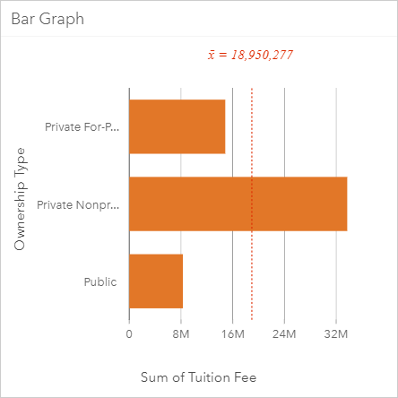
|
When To Use Compare data across categories, understand difference in levels between categories, identify trends, outliers, highs, and lows, across categories |
Data Types Needed Y-axis: A String field (e.g. Category, Type, City, etc.). Optionally, a second String field can be provided to group values by a sub-category. X-axis: An Integer or Decimal field. If this field is not provided, a count of the string values on the y-axis is displayed. |
|
Box Plot 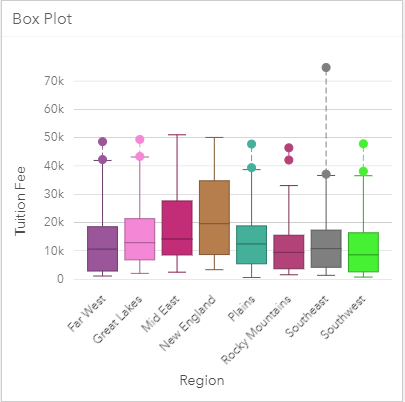
|
When To Use Visualize groups of numerical data using quartiles, view outliers in data |
Data Types Needed Y-axis: An Integer or Decimal field. X-axis: A String field can be optionally provided to group values |
|
Bubble Chart 
|
When To Use Compare proportions of categories, how data categories are related |
Data Types Needed Y-axis: A String field. X-axis: An Integer or Decimal field. If this field is not provided, a count of the string values on the y-axis is displayed. |
|
Chord Diagram 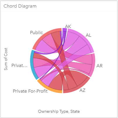
|
When To Use Visualize inter-relationships and connections between categories |
Data Types Needed Y-axis: An Integer or Decimal field. If this field is not provided, a count is displayed. X-axis: Two String fields. |
|
Column Chart 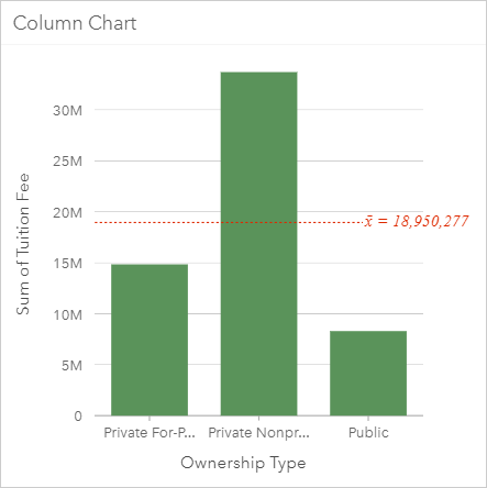
|
When To Use Compare data across categories, understand difference in levels between categories, identify trends, outliers, highs, and lows, across categories |
Data Types Needed Y-axis: An Integer or Decimal field. If this field is not provided, a count of the string values on the x-axis is displayed. X-axis: A String field (e.g. Category, Type, City, etc.). Optionally, a second String field can be provided to group values by a sub-category |
|
Data Clock 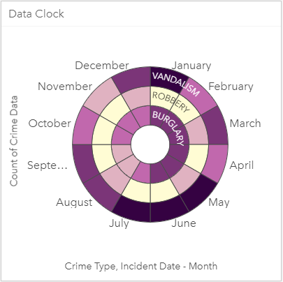
|
When To Use Understand how much data exists at different periods of time |
Data Types Needed Y-axis: An Integer or Decimal field. If this field is not provided, a count is displayed. X-axis: Two String fields. |
|
Donut Chart 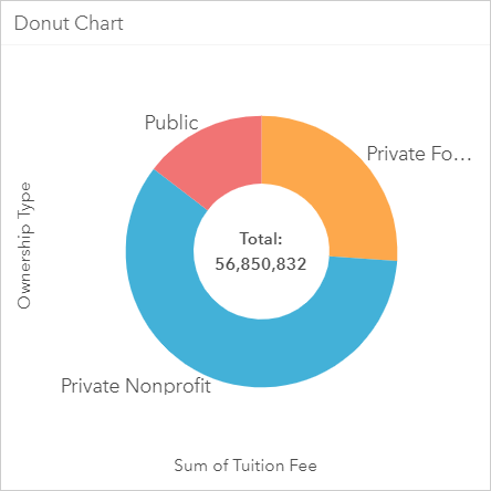
|
When To Use Compare proportions of categories |
Data Types Needed Y-axis: A String field X-axis: Integer or Decimal field. If this field is not provided, a count of the string values on the y-axis is displayed. |
|
Heat Chart 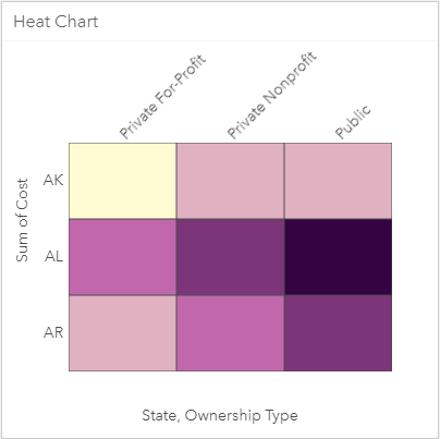
|
When To Use Visualize relationship between two categories |
Data Types Needed Y-axis: An Integer or Decimal field. If this field is not provided, a count is displayed. X-axis: Two String fields. |
|
Histogram 
|
When To Use View distribution of numeric variables and their frequency of occurrence within a dataset, view outliers in a dataset |
Data Types Needed X-axis: Integer or Decimal field. |
|
Line Graph 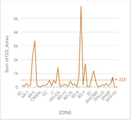
|
When To Use Compare categories of data, compare differences/changes in a numeric value across categories |
Data Types Needed Y-axis: An Integer or Decimal field. If this field is not provided, a count of the string values on the x-axis is displayed. X-axis: A String field. Optionally, a second String field can be provided to group categories
|
|
Link Chart 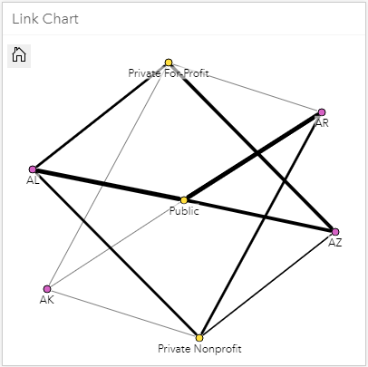
|
When To Use Visualize relationships between categories, visualize flow of information between categories |
Data Types Needed Y-axis: An Integer or Decimal field. If this field is not provided, a count is displayed. X-axis: Two String fields. |
|
Scatter Plot 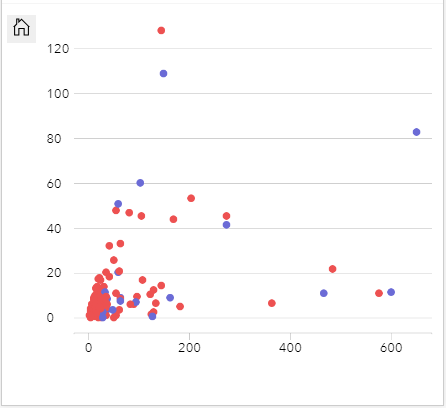
|
When To Use Determine whether two variables are correlated and the strength of the correlation, compare distribution of two numeric variables, view outliers within a dataset |
Data Types Needed Y-axis: An Integer or Decimal field. This is the independent variable. Optionally, a second Integer or Decimal field can be provided X-axis: An Integer or Decimal field. This is the dependent variable. Optionally, a second String field can be provided to color code the numeric values by category |
|
Time Series Graph 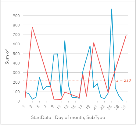
|
When To Use Visualize trends in counts or numerical values, and how they change, over time. |
Data Types Needed Y-axis: An Integer or Decimal field. If this field is not provided, a count of the date values in the x-axis is displayed. X-axis: A Date/Time field. Optionally, a second String field can be provided to group categories
|
|
Treemap 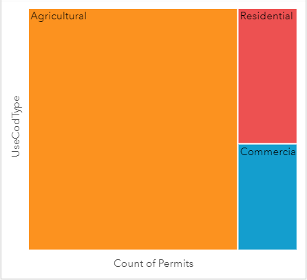
|
When To Use View hierarchy or compare proportions of categories |
Data Types Needed Y-axis: A String field. Optionally, a second String field can be provided to group categories X-axis: Integer or Decimal field. If this field is not provided, a count of the string values on the y-axis is displayed. |
Author: Solomon Pulapkura. Contact Solomon on LinkedIn